Most people remember the first time an outfit made them stop in their tracks. Not because it was complicated, but because the colours felt bold. Two or three shades, sitting confidently next to each other, refusing to blend, and still looking as chic as ever. That moment of visual clarity is where colour blocking in fashion begins.
Colour blocking did not start as a trend people tried to master; instead, it felt like a natural response to colour itself. Fashion designers used colour blocking for decades to push boundaries, creating strong identities, even before the term was mainstream.
What is Colour Blocking in Fashion?
Colour blocking in fashion is simply about letting colours speak for themselves. Instead of blending shades, you place two or three solid colours (sometimes more) side by side and let the contrast do the work. This is why an outfit can look styled and confident without needing prints or heavy details.
The technique gained global attention in the 1960s through Yves Saint Laurent and the now-iconic Piet Mondrian-inspired sack dress featured during the fashion house’s Fall 1965 runway show. This fashion moment helped usher in the colour block fashion trend, pushing designers to not only embrace colour but also push the boundaries with it. Colour blocking was then largely popularised by Black fashion designer Stephen Burrows.
Over time, colour blocking moved easily through fashion history. From art-inspired dressing to sharp nineties minimalism, the technique proved flexible. It worked with clean tailoring, relaxed silhouettes, and for people who preferred bold expression. This adaptability explains why colour blocking remains timeless.
Today, colour blocking feels especially relevant because fashion feels more personal. People want outfits that look intentional without feeling overworked, and colour blocking offers that balance. When contrasting colours are worn properly, the trend makes even simple pieces look deliberate, elevated, and put together.
With the desire to colour block properly without looking like you got it all wrong, here’s the ultimate guide that breaks down colour blocking in a practical, wearable way. Because at its core, colour blocking in fashion is about control, where each colour holds its own space.
Understanding the Colour Wheel
Before getting into how to master the colour blocking in fashion, it helps to understand how colour blocking works in the first place. The colour wheel explains the logic behind pairings that feel balanced instead of random. Think of it as a guide that keeps colour blocking intentional, even when the shades are bold.
Complementary colours sit opposite each other on the wheel. Blue and orange, purple and yellow, red and green. These pairings create a strong contrast, which is why they feel energetic and eye-catching. In colour blocking, complementary shades work best when one colour leads and the other supports.
Analogous colours sit next to each other. Pink and red. Blue and teal. Green and yellow. These combinations feel softer and more refined because the colours already share undertones. For colour blocking beginners, this approach feels intuitive and easy to wear.
 Photo Courtesy
 Triadic colours form a triangle on the wheel. Yellow, blue, and red are classic examples. This is the bold option, but it works when balance stays front and centre. One colour should dominate, while the others play supporting roles. That restraint keeps colour blocking from tipping into chaos.
Neutrals help colour blocking in fashion breathe. Shades like white, beige, grey, brown, and black create pauses between strong colours. These shades ground the look, soften contrast, and make bold pairings feel wearable. When in doubt, a neutral piece can steady even the most confident colour blocking combination.
Here’s How to Wear Colour Blocking in Fashion
Colour blocking looks strongest when there is a clear plan behind it. The goal is polish, not overload. These practical rules help your outfit feel stylish and wearable, even when the colours are bold.
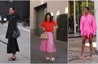
Consider the Colour Wheel
 Photo Courtesy
 Start with the colour wheel and decide the mood you want. Complementary colours sit opposite each other on the colour wheel. This opposition is exactly why these shades create contrast.
The colours push against each other visually, which produces energy. Analogous colours feel calm and refined, and triadic combinations lean expressive. Choosing this first keeps colour blocking focused instead of experimental.
Keep Colour Saturation Consistent
 Photo Courtesy
 Jewel tones work best with other rich shades, while pastels look cleaner when paired together. Mixing muted colours with very bright ones often breaks the balance and makes colour blocking in fashion feel uneven.
The Neutral Anchor
 Photo: Instagram/@olarsgrace
 If you’re just trying the colour blocking trend, you’d want to use a neutral anchor to steady your look. White, camel, grey, or charcoal can sit between strong colours or appear as a base piece. For colour blocking in fashion, neutrals create space and help the eye rest.
Add a Third Colour Using Accessories
 Photo: Instagram/@priscastyleme
 Accessories offer an easy way to add a third colour. A cobalt shoe, green bag, or bold belt can complete the palette without overwhelming the outfit. This works especially well for colour blocking beginners.
Go for a Patterned Piece
 Photo Courtesy
 Patterns can act as a bridge. A print that already contains your chosen colours ties solid pieces together and softens contrast. The key is scale; keep the pattern controlled so it supports the look.
Play with Proportions
 Photo Courtesy
 Use colour placement to shape the body. A lighter shade on a deeper tone can create a higher waistline. Vertical splits in colour can lengthen the leg. In colour blocking, proportion is one of the easiest ways to wear the trend.
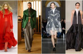
The Three-Colour Trick
 Photo Courtesy
 Trust me, three is magic. Sometimes adding more starts to feel like a rainbow exploded. Keeping it to three colours makes you look sophisticated and, frankly, this trick makes it way easier to pull off the colour blocking trend without stressing.
The Power of Texture
 Photo: Instagram/@cladinistudio
 Textures also count when it comes to colour blocking in fashion. Add silk or wool in your desired colours, and your outfit is sure to gain depth. It’s like your clothes are whispering, “I’m thoughtful, but still fun.”
The Ombre Effect
 Photo Courtesy
 Think of the Ombre effect as colour blocking’s smooth cousin. One shade fades into another, so your outfit still has visual interest without harsh breaks. It’s perfect when you want to play with multiple colours but keep the look effortless and cohesive.
The Inner vs. Outer Layer
 Photo: Instagram/@priscastyleme
 Here’s a hack: your dress can be one colour, but your coat or blazer? Make it the contrast. This feels like your outfit is playing a little peek-a-boo, and yes, it looks stylish.
Confidence as the Final Layer
 Photo: Instagram/@hintofglamour
 Nothing sells colour blocking in fashion like confidence. Walk like you planned every shade, seam, and panel. Because confidence is the thread that pulls the whole look together.
Photo Courtesy
You May Also Like:
Celebrity Haircare Brands: 14 Stars Revolutionizing Your Haircare Routine
March 30, 2026Fall 2026 Runway Trends: 12 Bold, Romantic & Futuristic Looks Defining the Season
March 19, 2026How Cloud Dancer Colour Trend Took Over the 2026 Oscars
March 17, 2026How Celebrities are Turning Lingerie into Chic Fashion Moments
March 17, 202615 Boubou Dress Styles You'd Want to Wear Now
March 17, 2026Louis Vuitton Women’s Fall 2026 Combines Nature, Folklore, and Bold Escapism
March 11, 2026Chanel Fall 2026 Collection: The Butterfly Effect – Matthieu Blazy's Transformative Vision at Paris ...
March 10, 2026How Designers are Using Recycled Materials to Create Covetable Wardrobe Pieces
March 9, 2026Honouring the Women Who are Impacting the African Fashion Industry
March 8, 2026Kim Kardashian Dressed Like a Vegas Showgirl and No One Saw It Coming
March 6, 2026Tom Ford Fall 2026 Collection: The ’90s Revival No One Saw Coming
March 5, 2026Dior Fall 2026 Collection Revives the Peplum at Paris Fashion Week
March 4, 2026

Evelyn Adenike is an Associate Beauty Editor at Fashion Police Nigeria, where she covers all things beauty, from the glossiest nail trends to the best skincare finds. With a soft spot for storytelling and an eye for what’s fresh, she brings culture, creativity, and just the right dash of drama to every post. If it’s bold, beautiful, and blog-worthy, Evelyn’s probably already writing about it.